
Recent Posts:
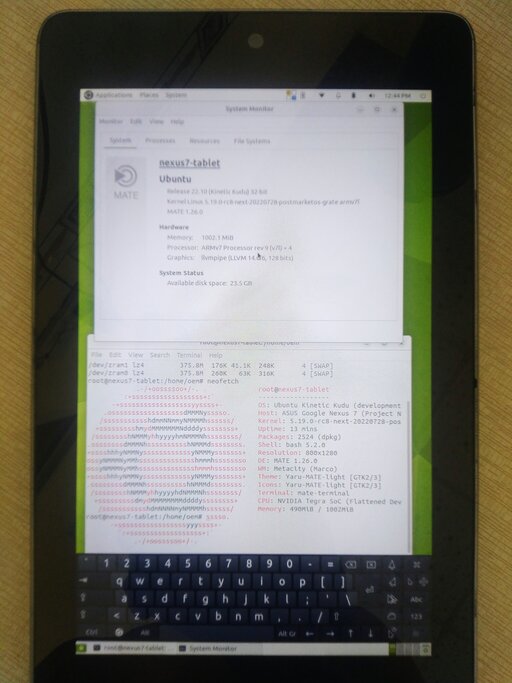
U Boot On Tegra Soc
As mentioned in the previous post, Nexus 7 2012 grouper/tilapia... more

Fosdem 2023
This event could view online at this link. They... more

Including Some Features To Jekyll Static Blog
I finished barebone static blog from Jekyll documents and... more
Deeping Inside Tegra 3 T30l Hard Part
This is hard part about Tegra 3 T30L, which I... more

Io And Temperature Cpu Thermal Throttle
This post, I share my experiences from I/O and CPU... more
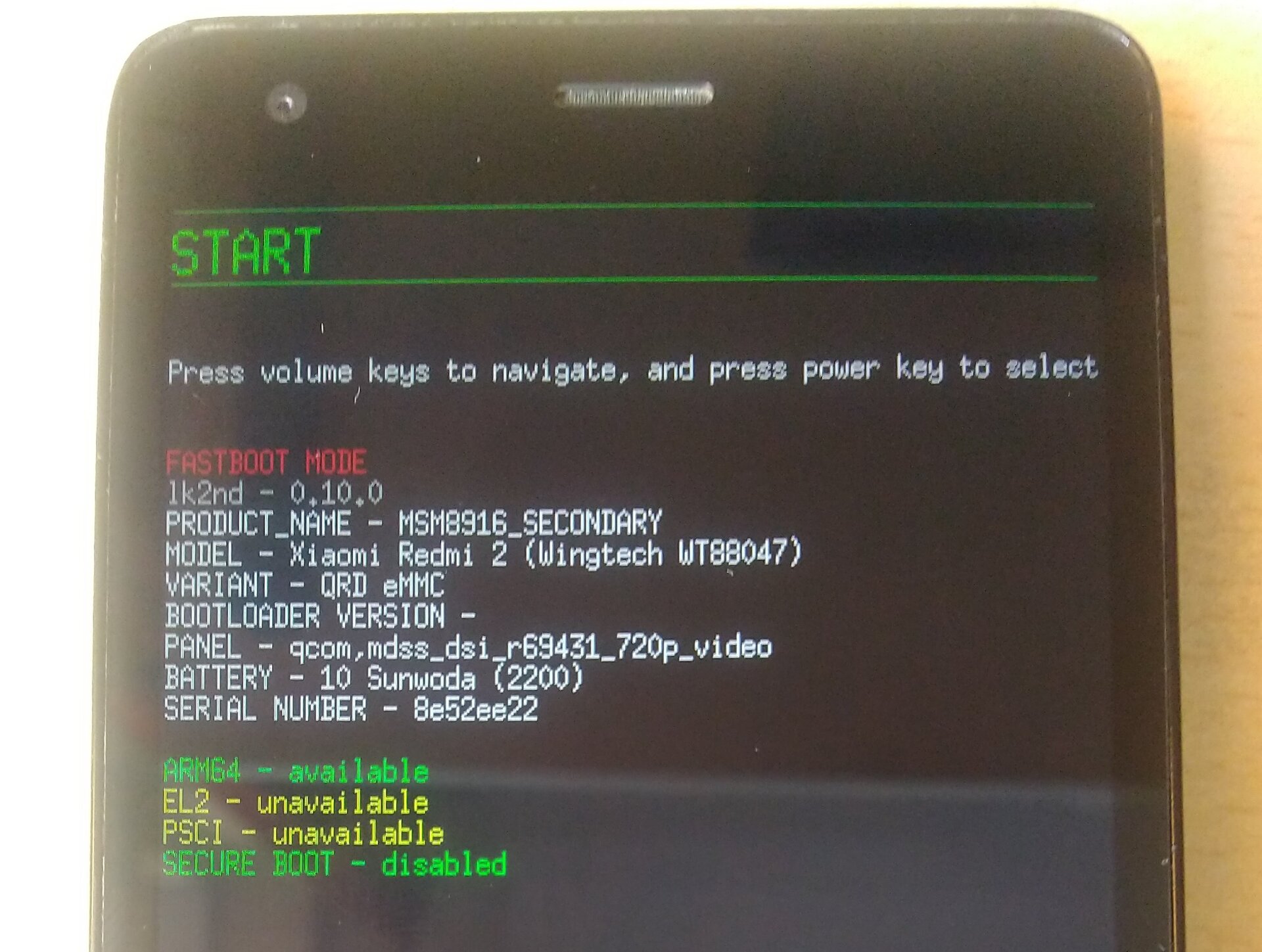
Msm8916 Redmi 2 And Samsung Galaxy A5 Duos
I wrote some lk2nd experiences at previous post. Xiaomi Redmi... more
Lk2nd And Snapdragon 410
How the system booting!? Let’s start, since Google created compatible... more
Soc Nvidia Tegra 3 T30l
This is the first SoC on ARM. Nvidia made ULP... more

Working On Command And Using Git
When I wanna push source code to git, I saw... more
Create A Website With Jekyll
When I was online, I saw some github.io website. I’ve... more